I've been thinking a lot lately about productivity.
In a way, it's become a bit of a theme for me over the past couple years: figuring out ways to tame the technology around us and make it work for our needs as opposed to just getting in our way. From the second we wake up in the morning, after all, we're surrounded by stupendous technology—but by default, it doesn't always operate in a manner that actually enhances our lives.
That's why I put together a guide to taming Android and turning your phone into a productivity powerhouse—a device that works for you and makes your life easier instead of serving as an added distraction and siphon of your time. Out of the box, most Android devices aren't exactly optimized for productivity. And some of the most pressing ways to resolve that revolve around scaling back what these devices do by default and turning down the noise they generate.
Now, as Google puts the finishes touches on its next-gen Android O release and gets ready to send the software into manufacturers' hands, I fear we're going to have another item to add onto the list of "unnecessary distractions you'll want to address."
I'm talking about Android O's new notifications dots feature. While the O release will bring some genuinely useful and productivity-enhancing new elements into the equation, this high-profile option strikes me as a step in the wrong direction.
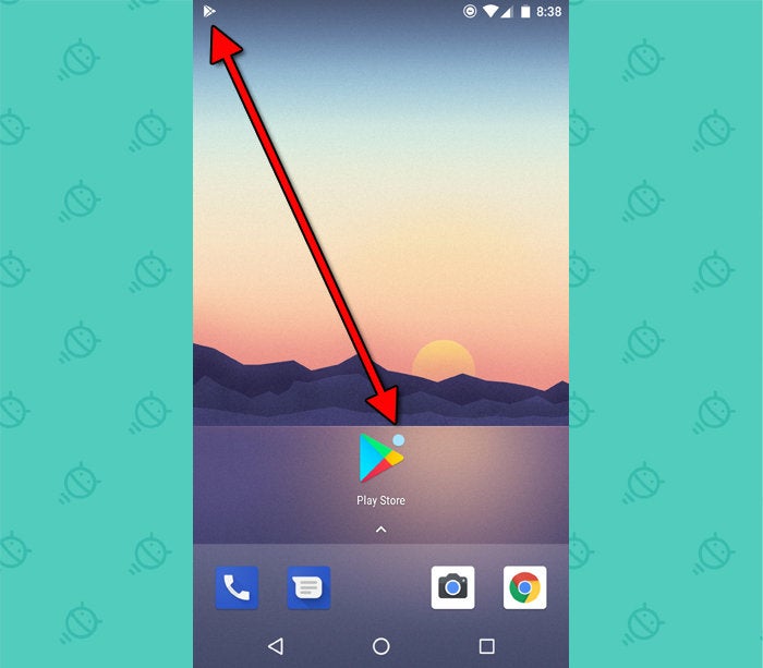
At their core, Android O's notification dots represent an expanded system for delivering notifications. As the name suggests, the feature causes a dot to appear in the upper-right corner of an app's icon on your home screen whenever that app has a notification pending. Notably, that dot is redundant with the presence of an icon representing the same notification at the top of your screen—in, y'know, the notification panel—and thus serves only as an added distraction and a nag to you, the user.
 JR
JR "Hey, look! I'm down here, too! Don't ignore me! OPEN ME! NOW!!!"
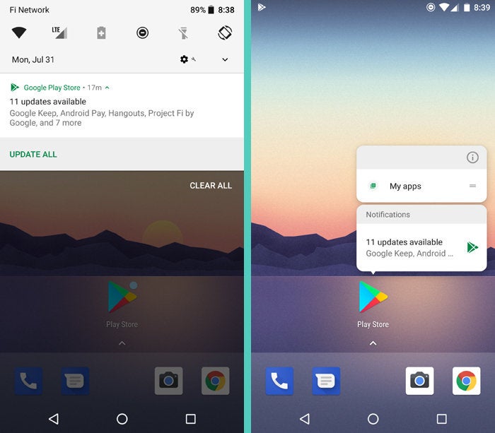
When a dot is present, you can long-press the icon to see the notification and then either tap the notification to open it or swipe to dismiss it—in other words, the same exact things you can do with the regular notification that calls for your attention just inches above. Or, of course, you can do what the dot really wants you to do and open the app to interact further.
 JR
JR Anyone else getting a hankering for some Doublemint gum?
As I've been getting to know Android O's various elements over these past several months, I can't help but think this particular addition feels more like a subtraction when it comes to user experience and interface optimization. It seems like a more rudimentary method of providing notifications that might have existed before the centralized, streamlined, and easy-to-manage primary notification system came into play. And having it show up now in addition to that primary notification system—one of Android's distinguishing elements since the platform's earliest days—comes across as an odd sort of regressive duplication.
(And yes, I realize this concept of notification dots is eerily similar to the icon-based notification badges that have long been present on iOS. And you know what? This wouldn't be the first time that Apple's influence has steered Android in the wrong direction and held it back from achieving an optimal user experience.)
We're reaching a point where those of us serious about productivity are increasingly looking to dial back how often and in what ways our devices demand our attention—and figuring out how to effectively corral notifications is a core part of that process. What we need now is less distraction—be it aural or visual—and more thoughtful and meaningful ways to manage the tasks and connections our mobile devices allow.
Implementing a home-screen-icon badge that shows a countdown to an upcoming reminder or event, for instance, makes sense. (And some third-party launchers already provide such a feature.) But adding a redundant alert designed to pull you away from what you're doing isn't exactly a productivity-oriented innovation. Imagine how annoying that's going to be when it shows up on icons all across your home screen and beckons you to break your concentration and go open each of them immediately—which you inevitably will do. It's basic psychology.
Not convinced? In a post on its Android Developers Blog, Google notes that notification dots are designed to serve as "a new way for developers to surface activity in their app" and "driv[e] engagement." I don't know about you, but "driving engagement" in apps—understandable as it may be from a developer's perspective—doesn't exactly line up with my own personal productivity goals.
The good news is that it's relatively easy to disable Android O's notification dots on an app-by-app basis: You just go into each app's settings screen, tap "App notifications," then deactivate the toggle next to "Allow notification dot." (Update: There's also a universal option to disable the dots altogether within the "Apps & notifications" section of Android O's system settings.)
The bad news is that it'll be one more thing for you to address if you want to minimize a device's distractions and optimize its productivity potential. And as with some other recent changes to the Android operating system, it's a shame to see that sort of backward slide in the software's default user experience.


